Safe Software
Role: Front End Developer/Designer Intern Team Members: Roger Aikema, Jamey Gillis Duration of Employment: May - August 2016 Tools: HTML/CSS/JS, PHP, Wordpress, Illustrator
Overview
I designed and built web pages for the website Safe.com. I Built tools for Wordpress (using PHP) which allowed other members of the marketing team to create pages through templates that fit the site’s style guidelines. Additionally, I redesigned and implemented new customer feedback forms that were easier to understand and complete. The following are two of the several projects I completed while working at Safe.
Project 1: Transformer Gallery
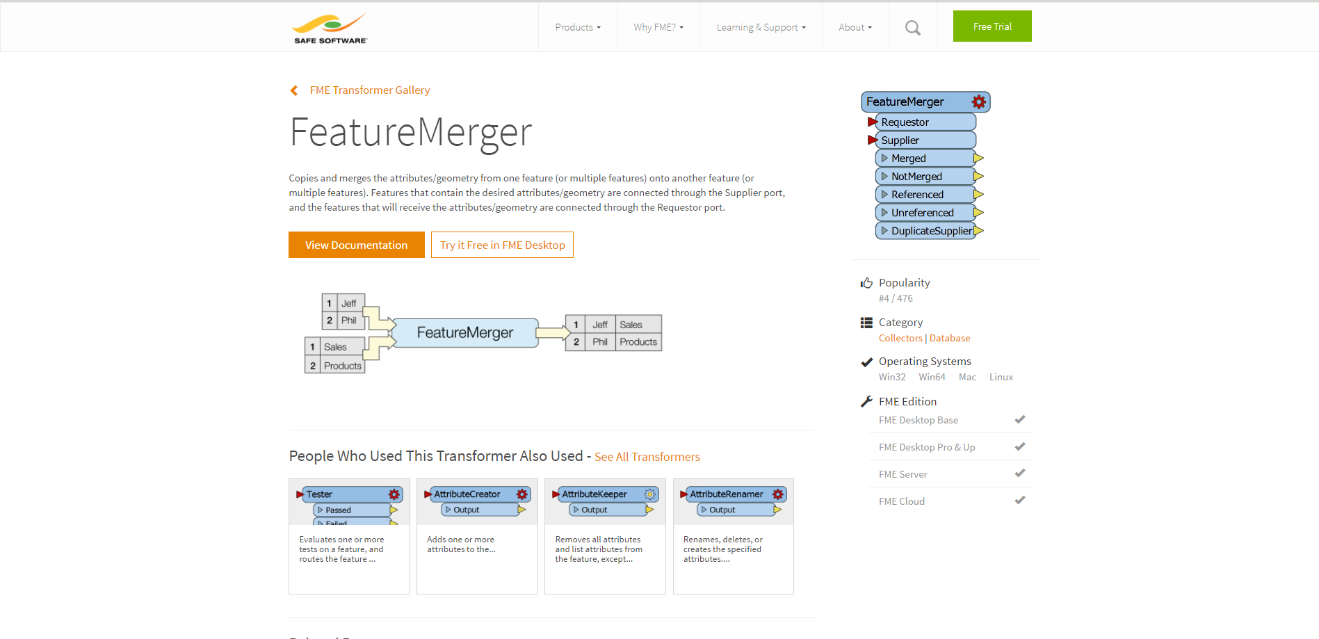
Issue
The transformer gallery is a section of Safe.com that lists all of the transformer components of Safe’s main software product FME. This page was used frequently by prospective customers to see if FME was right for their needs. Unfortunately, the transformer pages did not display enough information about compatibility with FME, and they were not in the same style as the rest of the site.
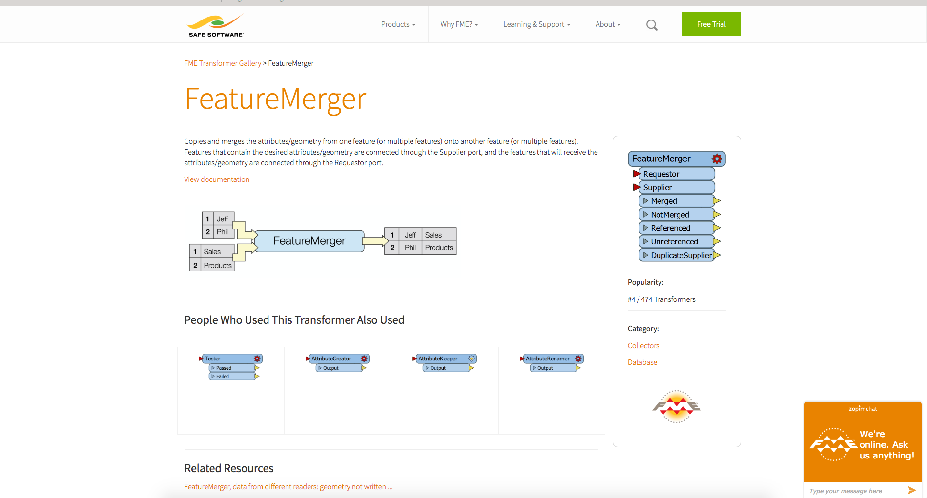
Process & Design Decisions
Initially I took a somewhat radical approach to the redesign by suggesting a sidebar interface that allowed search and navigation functionality. However, this was determined to be too different from the rest of the site’s styling. Eventually, the design settled on a similar but more focused visual hierarchy that allowed the user to find more information about a transformer in a consistent and easily visible location.
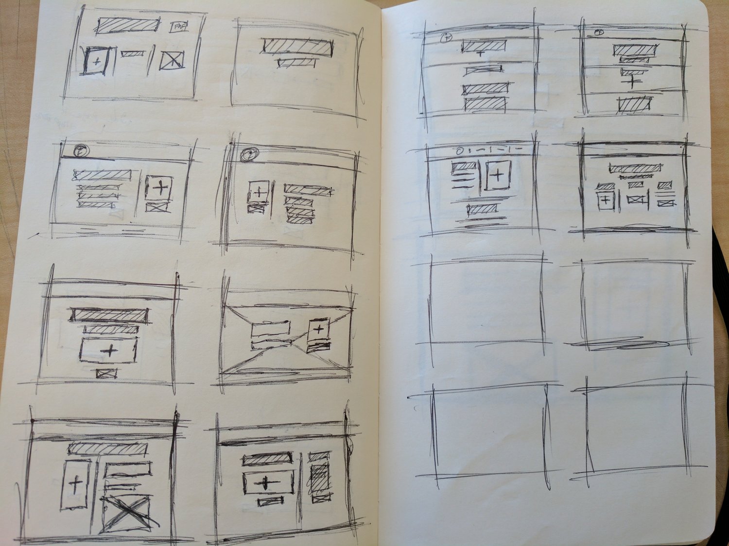
Result
This new design gave the user more information including version compatibility and additional information regarding related transformers and topics.
Project 2: Customer Survey
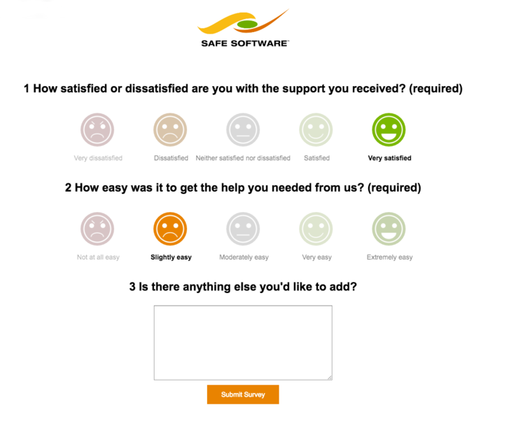
Issue
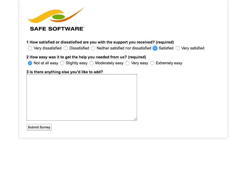
This survey was designed to get feedback on how the user felt about their support experience. It was designed to be simple and quick to fill out and was sent to the user immediately after their support ticket was closed. The issue was that the survey was getting getting mixed results in some instances (ie: Positive comments with negative and dissatisfied ratings). The goal of the redesign was to eliminate these inconsistencies so that the user always selected the rating that they felt represented their experience best.
The main constraint was that the redesign had to be fully implemented in CSS. Due to the survey being constructed by Salesforce it was not feasible to change the survey’s HTML.
Process & Design Decisions
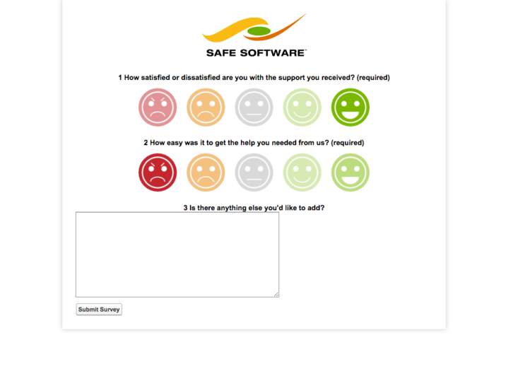
I began the redesign by sketching out different ways of representing the available options. The emoji representation was settled on due to its lack of reliance on language, this was especially important as the respondents to the survey often had English as a second language. Secondly, the emojis were coloured using the Safe Software colour swatches. Using the greens, yellows, reds, and oranges to differentiate between positive and negative ratings.
The next most important factor was general readability and responsiveness. The font size was increased across the board and a clearer definition of hierarchy was implemented to better guide the user’s eyes through the page. To add responsiveness the page content was centred and width values were changed to percentage values to allow a good experience across all devices.
Result
Once the new survey was deployed the Customer Support department reported zero mixed results in the two months following as well as an uptick in amount of surveys completed with the new layout implemented.


